Grouping items for on-page progressive disclosure
# Scrolling versus clicking
In today’s world scrolling through an entire webpage is common behavior. In fact, scrolling creates a better user experience because people generally perceive scrolling to be less “risky” than clicking through to other unknown pages (opens new window).
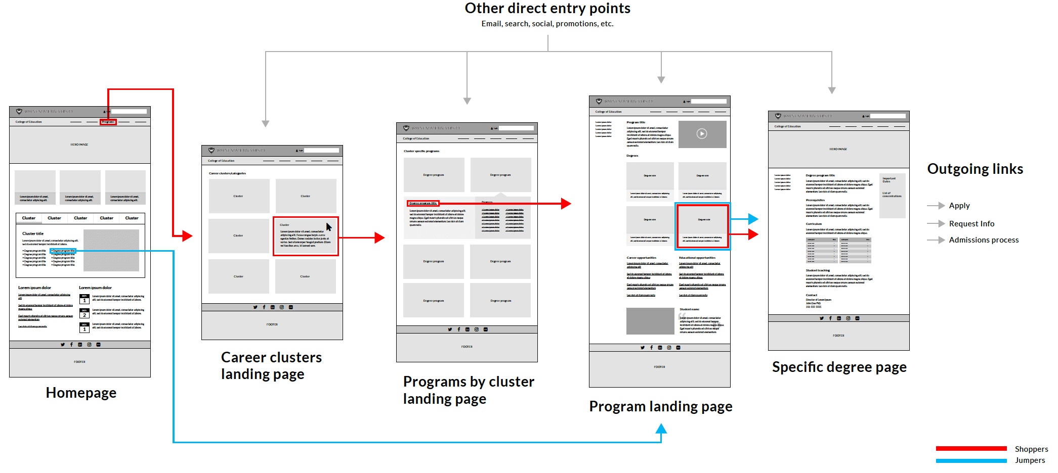
We have frequently advocated for longer pages rather than highly dense information "above the fold." High density information refers to a large volume of data packed into content positioned in the upper part of a page so it is visible without scrolling. When we have high information density we are requiring the user to spend quite a bit of time reading while trying to digest the page’s goals and complete tasks. This can be taxing and might require a second or third readthrough which is not user friendly. In order to keep things less complicated, we use a design pattern technique that sequences information across several screens building from simple to complex actions known as progressive disclosure. We present basic information higher on the page while keeping that information relatively simple – and present a group of links leading to pages that provide more detailed information on each topic.
# Progressive disclosure of information

Since we want to keep information density low, this requires direction and signals on each page to give the user confidence that when they click, they will move in the correct direction with more detailed information becoming available as they journey forward. This progressive disclosure of information allows new visitors to get signals of next steps without being overwhelmed by dense content.
This process can be compared to driving along a highway to get to a new destination. The signs on the overpass give you a signal of what is coming up and the exit signs allow you to make decisions about the next step. As you exit from the highway to the service drive and then into city streets, the number of signs increases and the information density becomes higher.
# Grouping
A technique used to reduce the required number of clicks while at the same time providing progressive disclosure is to group elements on a single page. This technique may be possible if the goal of the page is to provide direction and next steps.

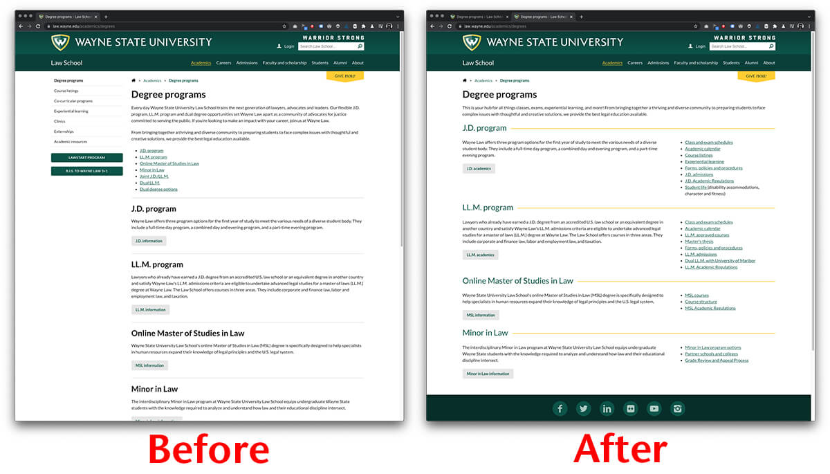
This example shows two versions of the same page listing the Law School degree programs (opens new window). The "Before" layout is our typical page that includes a menu with items that apply to most visitors and page content that introduces the programs and provides a single next step for each program to get more information. A bulleted listing of the programs titles with index style jump links, internal links that direct users to a specific section of the same page, can be found under the intro paragraph for quick reference.
The "After" layout makes some changes that shift the information into groups centered around the specific programs. The layout does a few key things:
- It ditches the on-page 'for everyone' menu and focuses exclusively on page content.
- It shortens the introduction and removes the index style jump links.
- The program names are instead highlighted visually with page separators to group the related information.
- Each program now has a short list of next steps that apply specifically to that program; the related links are grouped in a vertical list.
The result is a page that contains the same information but is shorter and has progressive information disclosed on the page itself in the shape of an "F" pattern (opens new window).
# Results

Reorganizing information can be helpful, but if it doesn't promote user interaction it can cause more harm than good. Since the same information is included within the “Before” and “After” pages we were able to compare page interactions along with the overall goal of connecting visitors to information quickly, reducing the number of clicks and time on the page.
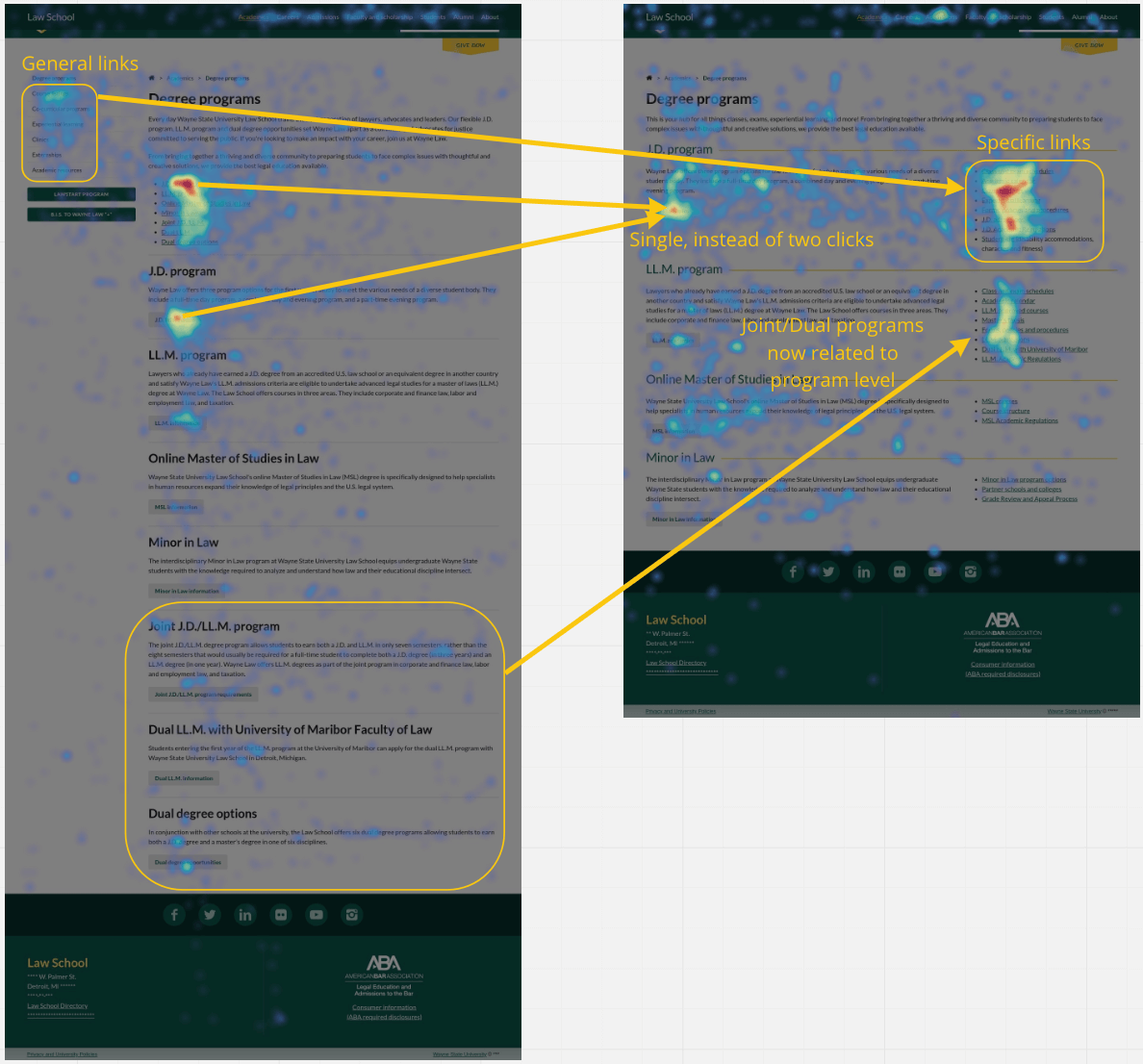
Using data visualization to represent the high click volumes in warm colors and low volumes of clicks in cool colors, the heatmaps show the movement of content and the clicks associated with the before and after layouts. They confirm:
- The majority of the interactions on the J.D. program “Learn more” did not drop
- The addition of the “Specific links” that came from the original menu (and now associated with each program) receive a higher number of interactions with the reorganization.
- The LL.M. program-specific links now include the Dual degree information – and it is receiving a higher number of interactions than when the dual degree program was listed separately.
# Time to interaction
With information progression in place, the interactions show more people are getting the right information. Is it taking them longer to complete this action because of the increased density? No!

Based on the average time on page, for the two months before the change compared to the two months after, it was reduced by 11 seconds. Additionally, 7% fewer people bounced when they visited the page.
# Conclusion
The heatmaps and time to interaction data points show it is possible to create a page with higher information density as long as the content is grouped to progressively lead the user to the major area, then give additional details (links) which are clearly relevant. There is definitely a limit to the number of details that can be provided, a balance between clarity and completeness. This did not include a test for the ideal number of links to include, but we used the top eight (seven would be ideal) items people use on the J.D., LL.M., and subsequent landing pages.