Our web design process, success in the details
Every project starts with a question or an idea. We then develop standard goalposts for that idea from the project sponsor using the data submitted through our New Project Request form (opens new window).
The goal of obtaining this data is to form a clear understanding of the contact, billing and budget details, determining how the project will align with the university strategic plan, and establish the first, second, and third priorities. Last but not least, we can identify what the consequences or alternatives may be if the project doesn't move forward.
# Initial project intake
Understanding the scope, timing, and goals of a project are needed to kick off any work. Even for internal projects, like the campus experience page, we set a goal to develop a plan consisting of a written explanation of the project, determining what success looks like, and listing out some non-negotiable items. Because we require this to be written, it helps to get the project sponsor and our team talking directly about tradeoffs and opportunities they may not have initially thought about.
# The initial draft of the content
We don’t originate the content in most cases, but we do shape it. No matter the format, Word document, Powerpoint or hand-drawn, we’ll take the initial draft of content any way we can. The goal is to arrange and organize the content in a linear fashion, similar to a small screen where we imagine the user can only consume one piece of content at a time, intending that as the user scrolls the content tells a story.
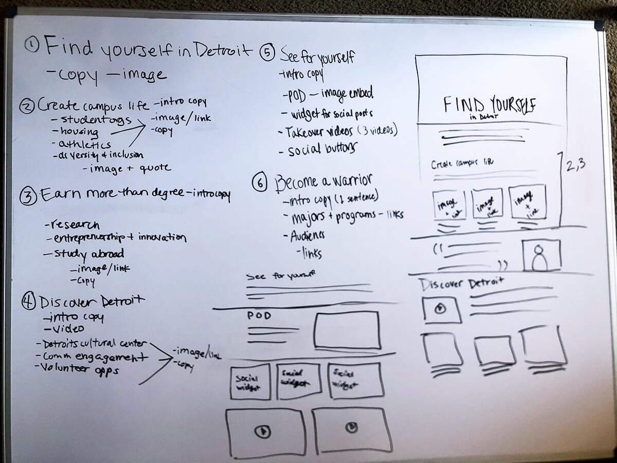
# Group discussion/sketch
Each meeting with the project sponsor involves a cross-section of the team, this includes a project manager, content administrator, designer, frontend developer, and sometimes a backend developer. Because a site can’t be published without each of these disciplines they are all at the table through the entire project.
The group sketch is lead by the designer who guides us through each component of the content to discuss the goal of the section, the words, how often updates will occur, the source of that content and visually, what would best represent those words and goals to ensure we have a source of that information in the short and long-term.
Once each area has those details, we start to visually outline how that content could be displayed. We have a number of patterns used throughout each of our sites, and although styled differently on each, the underlying information display is something we can reuse to present consistency to the end-user while still giving each site its own unique look.
We examine every section and the result is a long page containing each section outlined with possible layout options. At this point, it is a really rough visual, but it gives everyone a sense of space associated with each element.
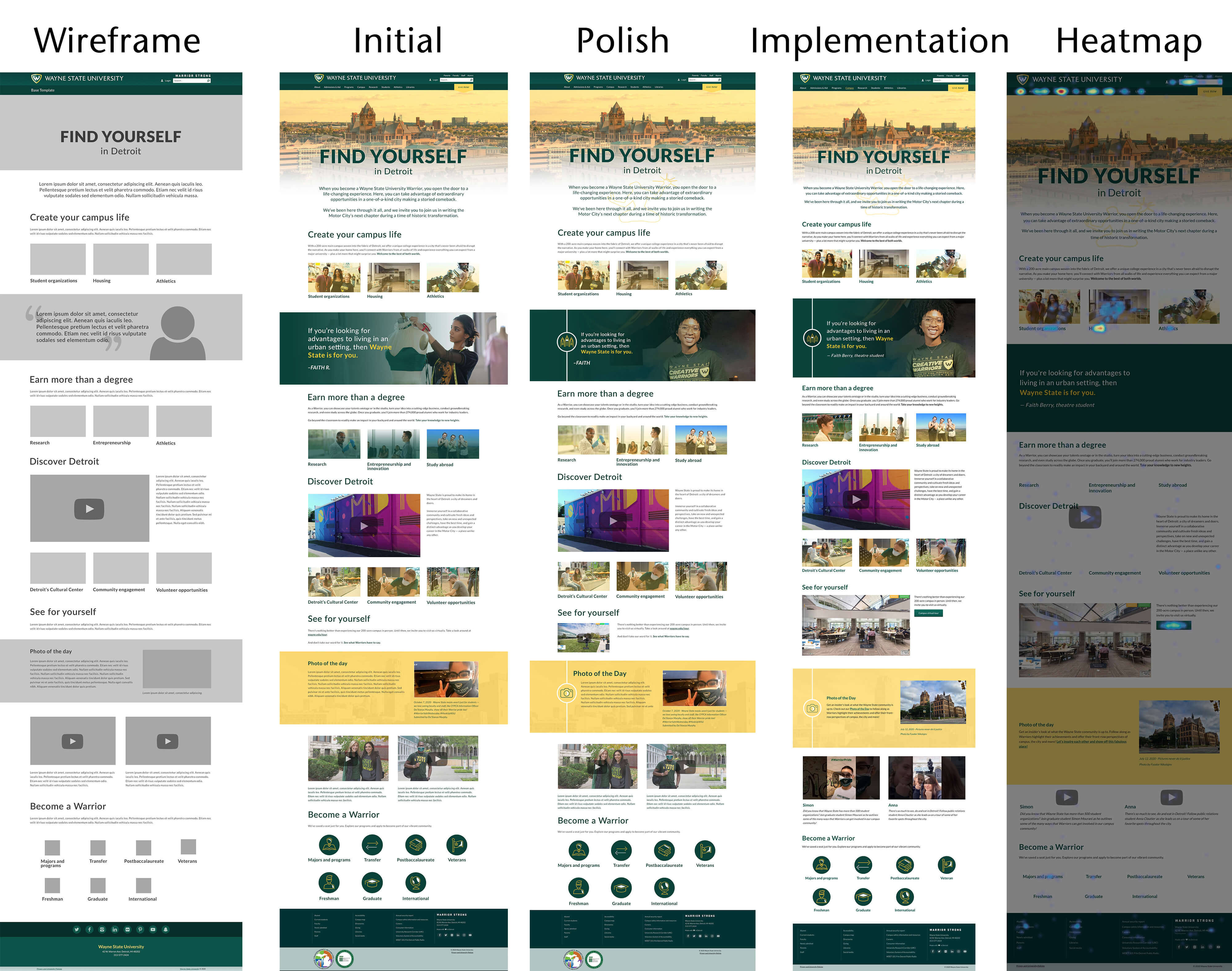
# Wireframes and spacing
From the sketch, the designer will use perhaps real content or content at its extremes, utilizing minimal to maximum length, and build out a more accurate wireframe that visualizes the actual width and height of content at various screen sizes. This is required for us to make decisions and tradeoffs and helps to lay the foundation for where content will move.
It also allows us to transition items without exerting too much effort since everything is structured in outlines and gray boxes. This more accurate representation of spacing is another opportunity to discuss content, types of images, and content at the extremes (maximum and minimum sizing) for things before they start to overflow or make an area look empty.
At this stage, content will likely be adjusted and images/videos and other assets will start to be gathered.
# Initial visuals added to the layout
Now that everyone is on the same page about the content priorities and the visual space each of the elements will occupy, it is time to add style to the elements. The goal of this style is not only to represent the university brand but also to be unique to the unit and enhance the visual display of the content as someone is consuming it.
The visuals typically happen in segments, starting with design direction, which consists of overall colors, spacing, sizing, and font choices. The designer typically works with the frontend developer to ensure the style is implementable and they collaborate with the accessibility coordinator to ensure contrast, element order, and other behind the scenes structural elements can be accomplished by the style.
This mockup uses as much real content as possible. After the mockup is fully designed, the entire team meets again to walk through the visuals, adjusting any content and images as needed to ensure the goals of each section are still being represented. Feedback on the direction of the visuals and adjustments are also made. The designers at this stage are responsible for ensuring there is enough spacing, contrast between elements and checking with various color blindness to meet accessibility criteria.
# Template programming to initial wireframe
At this point, the layout, content sources, and structure of the page are close to completion and the frontend developer starts to pull the source content into the page. This means determining which content comes from the page, promotions, news, events, and the rough image dimensions for each area.
We use a “style guide” page to allow the developer to work with fake content at its extremes while creating the frontend layout. An example of that can be found on our Base site (opens new window).
Once deployed, the real content is loaded into the page for preview. At this point an accessibility review occurs to ensure elements are visible to screen readers, all areas function with a keyboard only and zooming in still allows everything to be visible and usable.
# Polished visuals added to the layout
The designer then finishes up a round of polish on the design. This means the fine-tuning; adding any shadowing, animation and small adjustments that make the site feel intentional. Final icons and visuals are selected and optimized for the Web. The designer and Web Accessibility Coordinator ensure all visuals meet sizing and contrast requirements.
# Content added and additional visuals confirmed
At this point the only place content is edited is in the Content Management System (CMS). As soon as the initial content is passed into the wireframe it becomes living content in the CMS instead of a separate document. This ensures the unique properties of HTML can be utilized as early as possible.
We go through one last round of edits after seeing the content in its final medium and also complete an internal review of the design to ensure everyone is on the same page.
As soon as the final design is approved, the frontend developer starts adding the additional visual styles, animations, interactions and polish to the page.
# Final programming and polish
Polish, polish, polish. The last 20% sometimes takes 80% of the time. Making the design look, feel and perform at its best requires fine tuning and a handful of optimizations.
The site is tested on screen readers, on slow connections, while running automated and manual accessibility checks. Because this work is only completed once but utilized thousands of times per month, polish at this stage pays dividends. Shaving off 500kb of size could add up to gigabytes of bandwidth savings each month.
# What is success, goals and tracking over time
Depending on the goal(s) of a page or site, we try to incorporate some metric that can be tracked over time. This is something beyond the number of ‘visits’, ‘time on page’ and ‘bounce rate’. If a page doesn’t have a specific goal, it is worth your time to first determine what and how users are engaging with the page. It is beneficial to get a sense of how far people scroll, where their mouse is hovering and clicking (you may find people trying to click on things that are not links) and having an overall awareness of the opportunities available to shift content or get someone to take an action.
View the final Campus Experience live page (opens new window) to see and interact with the end result yourself.