Always be evaluating
You are not your users. This is something we've tried to instill in every decision we make.
A few weeks ago we had a suggestion we had thought about in the past but didn't move on for various reasons. The suggestion was to have buttons that we promote as "Call to action (opens new window)" buttons, which can be assigned to any page on a site, moved to be always visible on smaller screens.
This feels completely obvious, but testing it gives us qualitative numbers about the actual impact it makes. How we react and our next steps depend if in real life there is a 2% increase compared a 50% increase.
# A look at the test
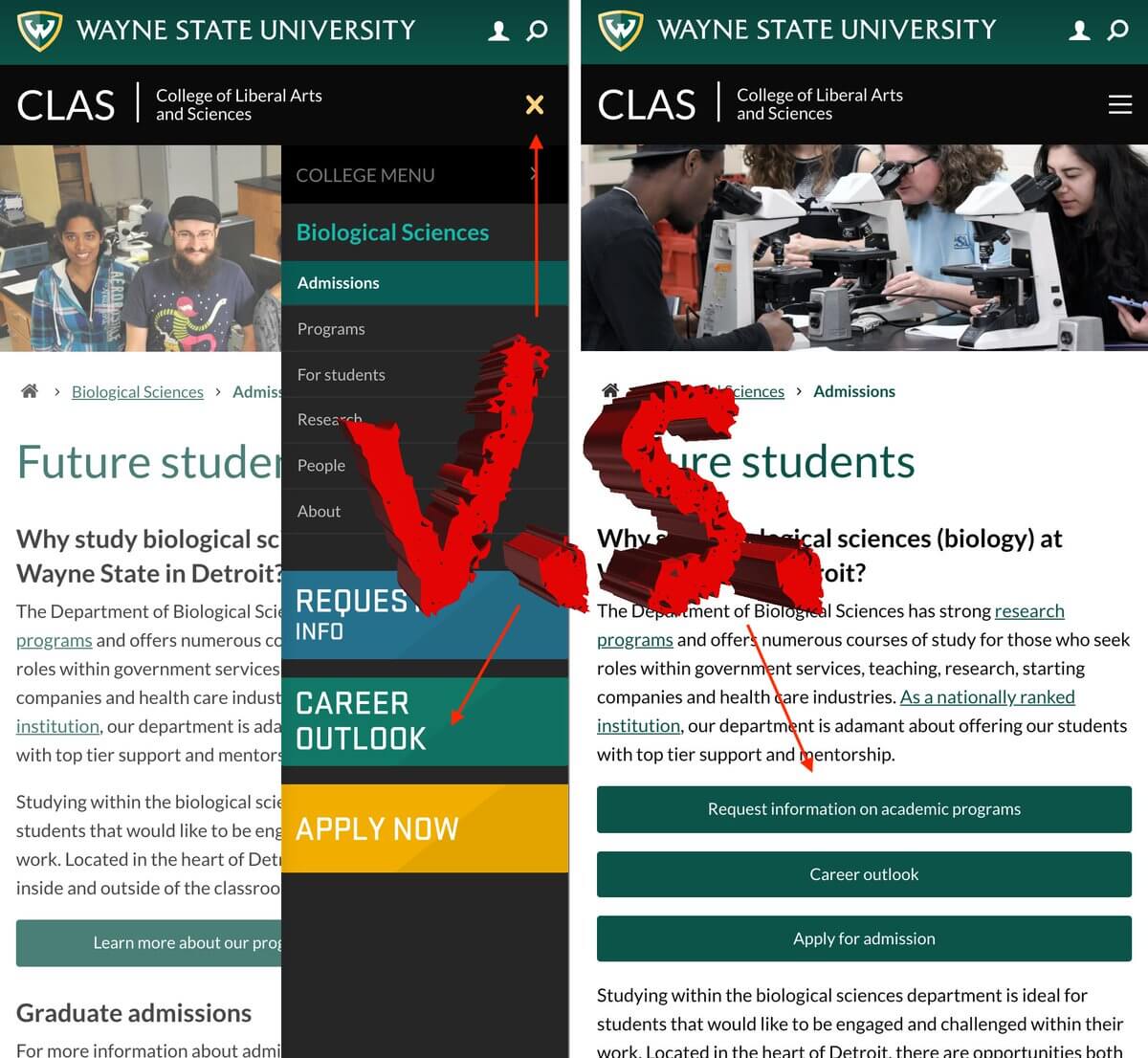
The buttons on desktop will stay as they are now, but on mobile we will move them into the content area so they are visible on scroll instead of click.
# Where to move the buttons
These buttons are used for various next steps that are related to the section or specific page the visitor is on. In the "Admissions" related areas, a "Request more information" button is a great next step for a visitor. On a specific program page, it may be a button to view the "Career outlook".
We didn't want to move the buttons too far down the page (yes visitors scroll) but we also didn't want to hit the visitor with the buttons first, before they were able to see any of the content of the page.
We decided on injecting the buttons after the first paragraph on the page. We know this isn't perfect but will do the job 80% of the time. If there are no paragraphs on the page, it places the buttons at the bottom of the content.

# The test over time
We used Google Optimize to create the second variant of the page that would test only on small screens and custom javascript to run and move the buttons.
The test would be active on any page on the College of Liberal Arts and Sciences (opens new window) website which could have under-menu buttons on them.
The "goal" for the test, as defined in Google Analytics, is a click on a call-to-action button.
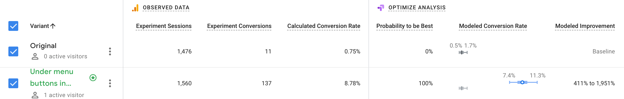
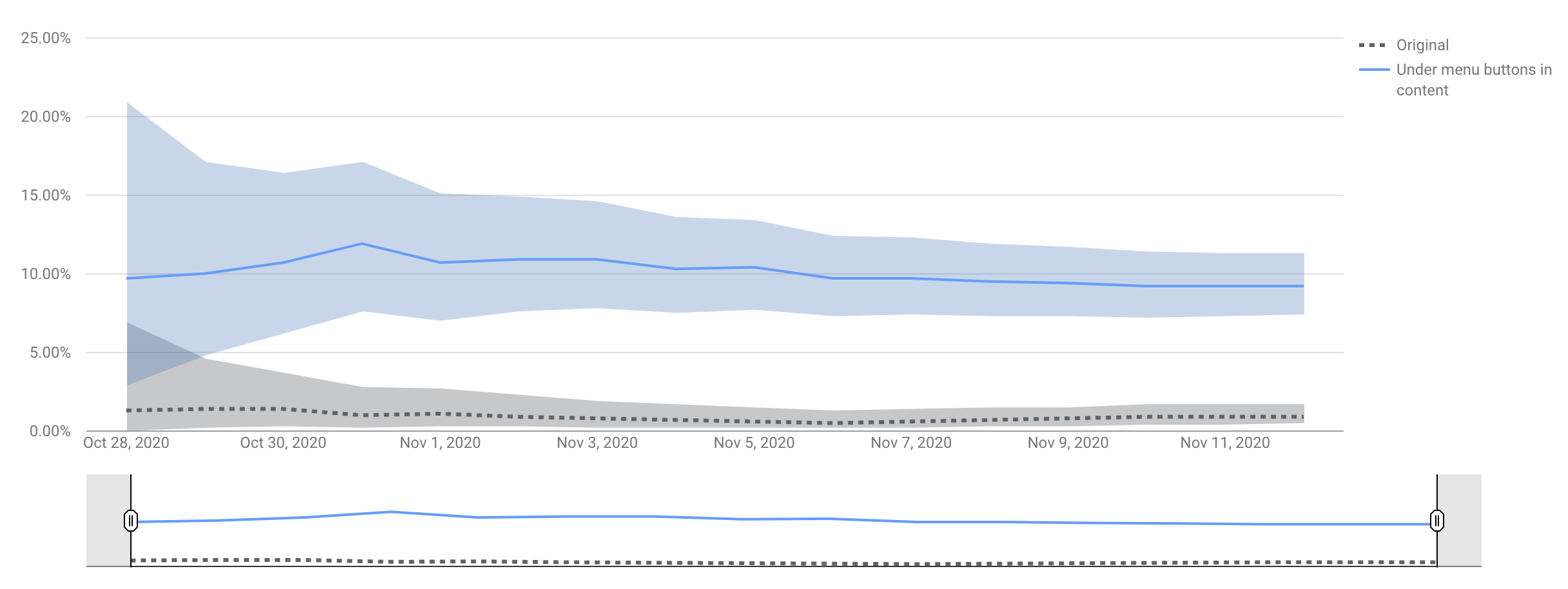
The results were pretty clear, even without a mountain of traffic, the "conversion" of a 0.75% to 8.78% (11 vs 137) was completely surprising. We knew more people would click since the buttons required less interaction to view or click, but a 400% increase makes a world of difference.
# Results after implementing the "winner"
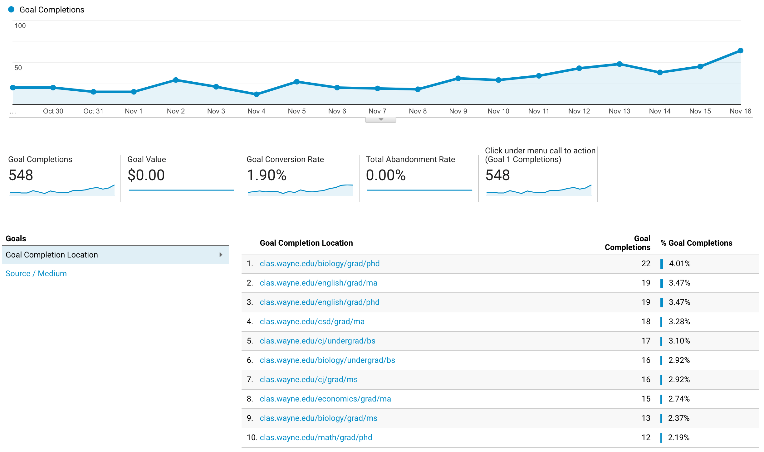
Since the winner was determined (as by Google's determination of statistical significance) the number of clicks on the call-to-action buttons continues to rise.
# Final thoughts
We had the hunch this would be a better user experience and we also knew each month the number of mobile (smaller screen) users increase, currently we are at about 35% overall as of the end of 2020. We anticipate that number will continue to get closer to 40% in 2021.
After confirming the scale of conversion increases with real users it shot this suggestion to the top of our list to implement across the board. We're planning to roll this change to all new sites and backfill it into the school and college sites that have under menu call to action buttons.
Yet another reminder that having data makes all the difference between chasing our tail implementing features on a hunch (even if they seem logical) to a clear motivation for anyone on the team to work on a feature that has a clear path to improvement based on real visitor.