Optimizing jpg images at 2x in Photoshop for high-resolution screens
# Why would I make a 2x images for my responsive site?
2x images are scaled-up and optimized for Retina/HiDPI screens. They're scaled to twice the size of 1x images, but since retina screens have twice the pixel ratio of most other screens they output the same size visually as 1x.
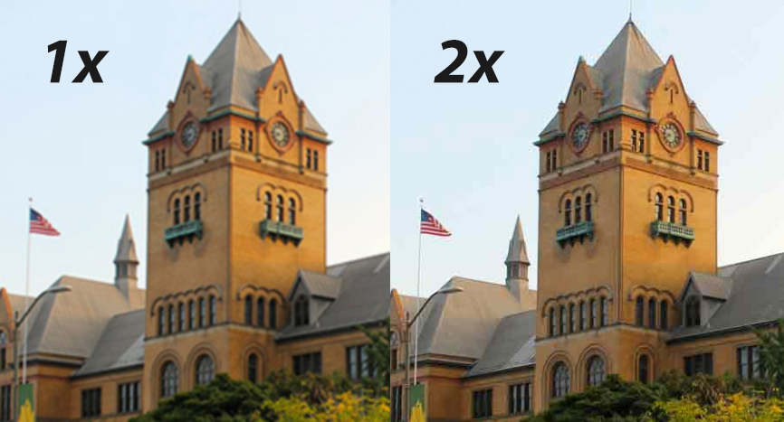
If the jpg image is 1x, it can look "fuzzy" or "pixelated" on higher DPI screens. Here is an example:
# Instructions on how to "2x up" an image in Photoshop for a 250x250px jpg image:
- Start with original document height and width dimension then multiply by two. These are your new height and width values. In this case, the new document size will be 500x500px.
- Original height x 2 = new height for 2x image
- Original width x 2 = new width for 2x image
- Import your higher dpi image or design as usual, but use the bigger version rather than the 250px image
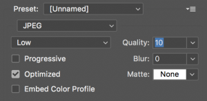
- When done, save for web at around 10 quality in Photoshop
# Video jpg 2x image Retina tutorial
[youtube https://www.youtube.com/watch?v=7cv2zXAUiW4?rel=0]

