Theater and Dance homepage redesign
Project/client: Department of Theater and Dance, College of Fine, Performing and Communication Arts
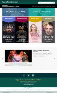
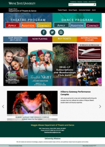
The first steps in this redesign process include an in-depth conversation with the client regarding the overall needs of the homepage for the Department of Theater and Dance website. The theater and dance department is a smaller unit within the College of Fine, Performing and Communication Arts at the university. To kick things off, the client created a mockup that illustrated attempts to solve some issues that they felt users were experiencing when visiting their homepage (theatreanddance.wayne.edu). See current live site (left) and initial mockup (right) below:
It was important for us to ask questions and find answers in an effort to fully understand what the client needed as well as its users.
The following questions needed to be addressed before we could successfully tackle creating a design that was successful:
▸ Who are the users? ▸ What are they coming for? ▸ What issues are they having in finding desired information? ▸ What are the goals that the department would also like to accomplish with the site?
After our conversation, we were able to begin gathering some insight:
_Q: Who are the users?
_A: The majority of users visiting the site are members of the prospective student community. Students, parents, teachers, and other individuals seeking information regarding admissions to the program, auditioning for programs, requesting information about the program, etc. The site also receives visitors who are seeking to purchase tickets to shows and events.
The client also shared that they were interested in increasing the number of users who visit to buy tickets. They shared feedback that it may take a user “too many clicks” to get to the information they’re seeking. Heatmap data from pages within the theatre and dance site show evidence that providing users with a way to access ticket purchasing from the homepage may be beneficial for both users seeking ticket information as well as the client in an effort to sell more tickets.
Q: What are they coming for?
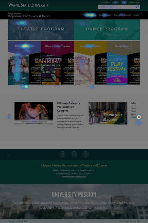
A: Most users visiting the homepage are seeking information about both the theater and dance programs. There are also a significant number of users seeking information regarding shows and performances. See heat map below for visualizations of this data. Over 20% clicks are on content related to theater performances and shows at university theater.
Q: What issues are they having in finding desired information?
A: Feedback from the client suggested that students–prospective in particular–are having issues with locating application materials, information about program auditions, and other steps in the application process. The client cited specific cases where the school made personal contact with a student regarding scholarship offers, enrollment, recruitment, etc. In these cases, some users reported difficulty in navigating to the next steps in the process once they arrive at the page. The client stressed the importance of making it easier for these students to perform basic tasks like submitting a university application and setting up an audition.
Q: What are the goals of the client for the site?
A: The client communicated clearly that reducing the number of clicks it took users to get to important information regarding the application process, as well making it easier for users to purchase tickets to shows were both main priorities. The following are also priorities of the client:
▸ Links to important parts of app process for EACH of the programs (separate navigation for both theatre and dance programs, see mockup for visualization)
▸ Social content in prominent spot in an effort to increase the number of followers on social platforms
▸ Page element to link to information about International studies programs/opportunities
▸ Use of “rainbow colors” to promote LGBT pride within theatre and dance community
What works, what doesn't
After the meeting with the client, the team debriefed on the information that had been gathered to put together a plan of action. Notes were combined and reviewed as the team walked through the perceived needs of the client and setting goals for what we felt the solution should accomplish.
The purpose of this conversation was to:
▸ Discuss what we learned
▸ Share ideas about what is and is not working with the current live site as well as the initial mockup presented by client
▸ Conclude what the client will need from a design solution
▸ Create sketch to visualize ideas (see below)
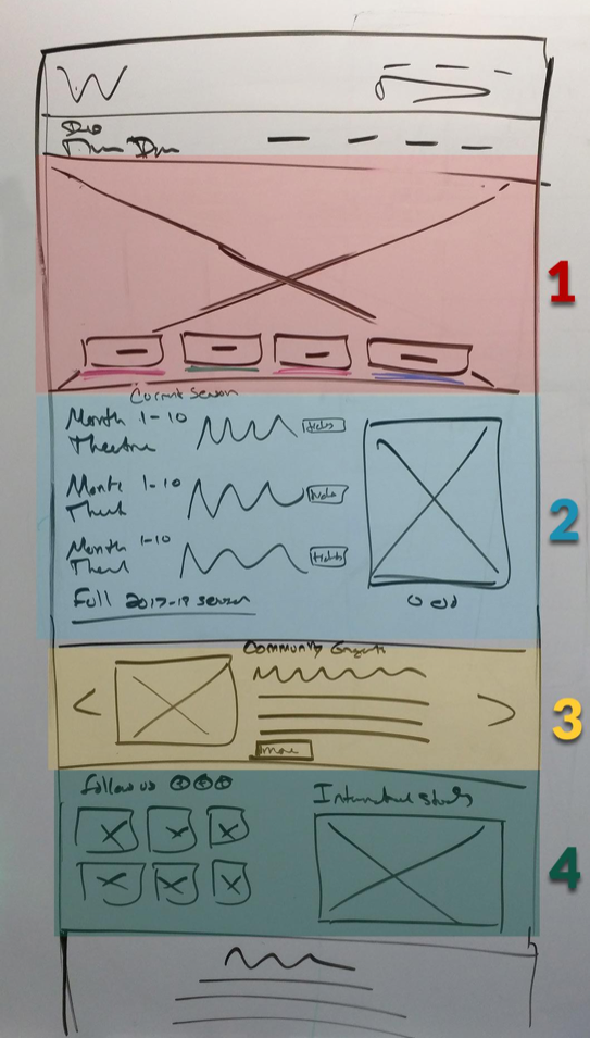
In an effort to make it easier to discuss our findings, I’ve divided the page sketch into 4 sections:
1. Hero image + secondary navigation 2. Shows + performances 3. Community engagement 4. Social + program highlights
Hero image + secondary navigation
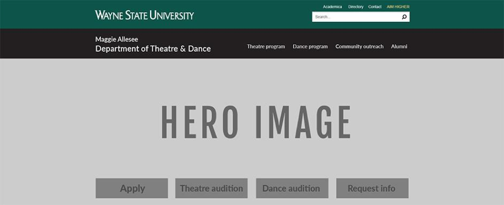
We decided that the very first few elements on the homepage should be a large hero image and a modified version of the navigation from the initial mockup that the client presented (pictured below).
Neither the current site or new mockup contain a hero image or any impactful visuals that give the user–from a glance–of what kind of content they will find here within the site. Displaying a large hi-res photograph illustrating students in the programs engaging in learning opportunities, images and/or video from shows, images and/or video of students in classrooms will accomplish this.
In the initial mockup, the client has suggested putting two different “menus” containing links to important parts of the application process that students will need to easily access. It was also shared that some of the information in each of these menus will take users to the same place (i.e. Apply button will direct to same university application). While the client expressed that getting its users to this information faster and with more ease is a priority, we felt that we could also accomplish this more efficiently and with fewer elements (see below).
Both Apply and Contact buttons in each of the menus (theatre and dance) from the proposed initial mockup from the client direct users to the same place, so we included one instead of two. The Apply button will direct to the same university application. The Request Info button will direct to the same page that will allow users to request information for each of the respective programs.
Shows + performances
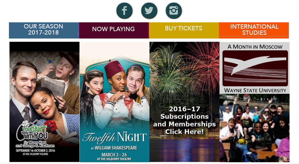
The second section, displaying information regarding shows and performances received a bit of a user interface overhaul from the initial mockup presented by the client (pictured below).
One of the goals of the site redesign was to make it easier for users to purchase tickets to shows, direct them to important information about the shows and programs. The solution to this presented in the mock from the client was to display several show posters and information across a great deal of page real estate.
This proposed solution several issues in terms of accomplishing those goals. While the show posters themselves are visually pleasing, they only communicate a fraction of the information that should be presented to users to fully accomplish the goal of giving users more important information with ease. Note that the title, date and time of shows are included here, but are very small. Small text that isn’t accessible by screen readers is discouraged with regards to accessibility standards, which is also of great importance in the higher education community.
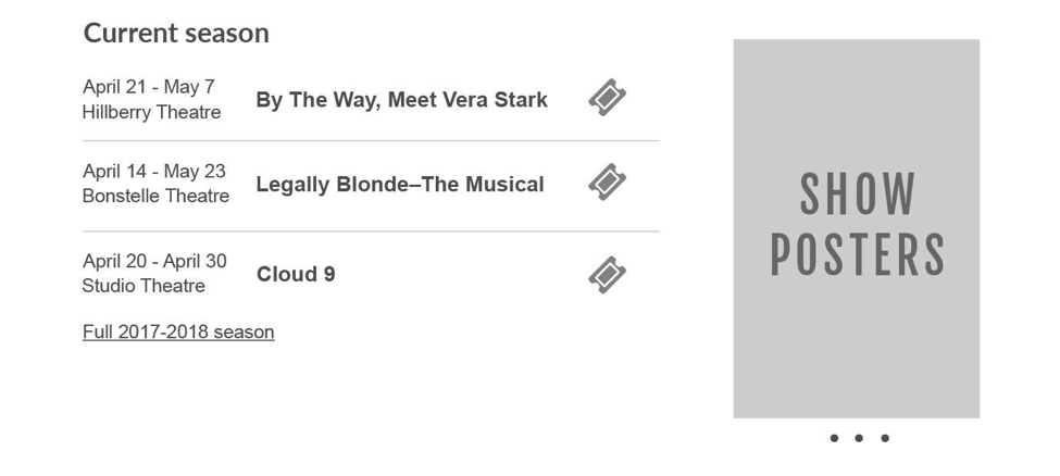
Our decision was ultimately to remove the important show information from the poster images (dates, locations, titles) and present them in a table making it easier for users to purchase tickets to a particular show. We still display the show poster images themselves (shown to the right of the table displaying current season content), but use far less screen real estate while giving users the options to view more than one, as the show poster images are scrollable content.
Community engagement
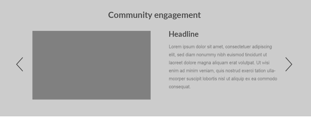
The community engagement section of the website required very few changes. To maintain consistency with the previous section of the site listing current season information, we decided to add a heading above the existing community engagement content. We also removed the small text that previously appeared on the photo in this area (see first image) to in an effort to maintain good accessibility practices.
The second image below is the new proposed layout for the community engagement area of the site.
Social media + program highlights
In our initial meetings, the client expressed that driving more traffic to their social media pages was both a goal and a priority. The initial mockup proposed by the client included 3 small buttons beneath navigation (pictured above in shows and performances section). We decided that the best way to drive that traffic wasn’t to put the buttons in a higher spot on the page, but to give social content more screen real estate at the bottom of the page. While social content is important, it should not take priority over content about the university program, shows, etc.
At a previous time in web standards history, it was recommended to put the most important content “above the fold” which implies placing page elements in a location where users do not have to scroll to see it. This has previously–and also in this case–influenced user interface of websites, and here being the reason for the placement of the social icons above other more important site content. With the increasing popularity of mobile/responsive design and currently more of a necessity, above the fold placement is no longer a concern, as user behavior has evolved and with that evolution the practice of scrolling is commonplace.
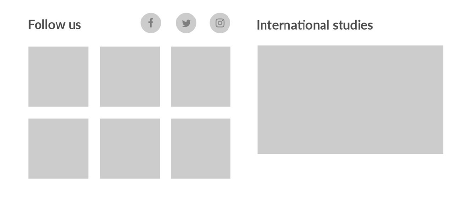
The solution we proposed for this section (pictured above) includes a photo grid that displays images from the departments Flickr feed with buttons linking to other social outlets, and a promo area for promoting programs (in this particular case, promoting international studies opportunities). This approach gives more screen real estate to social content, as well as creating an opportunity for more visually appealing content (i.e. various image promos, Flickr gallery).
In the initial mock, there was very little space for promotional material for any program related information. We felt that promotion of something like international studies was important enough to be added to the homepage, but not in the location that was proposed in the first mock (see image in shows + performances section, far right column).
Post launch changes
After the designs pictured above in previous sections were put into practice, there were a few very minor changes that were made.
1. Social icons are removed from flickr gallery 2. Location of international studies promotion and community engagement content are switched
One important thing to note when designing websites without final and real approved content, there will always be room for the layout to be adjusted to best suit the needs of the client.
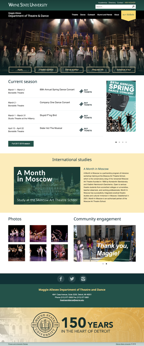
Once we worked with the client to put real content in place, we discovered that the area that we initially had designated as a promotional area (for international programs) will be better used to promote community engagement related content instead. Community engagement content requires less copy/details to provide enough context for users. However, the international studies content includes both a photo and detailed description of what the program does, how it benefits students. See image below for newest Theater and Dance homepage layout with real/current content and design.
Insights
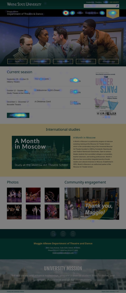
Now that the Wayne State University Theater and Dance homepage is redesigned and being used by many, we have an opportunity to look at what has been, done, why we did it, and how effective it was. To gather the most accurate data regarding how and where users are interacting with our site, we use technology that allows us to see where our users are clicking most. See the heat map below for more insights on user interaction.
From the heatmap, we can conclude a few things.
▸ Users are seeking information regarding the theater program
▸ Users are interested in show information, and seeking to buy tickets when visiting the site
Given that users are clicking most in the main navigation, table containing current season information, and on call-to-action that drives traffic to ticket sales, we can safely conclude that the adjustments made to the theater and dance site have indeed resulted in positive change with regards to the way users are interacting with the site.
We managed to introduce more visually appealing elements into the design, recreate information architecture in a more user-friendly manner, organize complex information in very simple and concise tables so that users/showgoers can purchase tickets with much more ease, give appropriate visual weight other program-related information, and address concerns about social presence. Overall, this project was a success.
