When less is more, A/B test insights
Last year we re-focused on the admissions area of wayne.edu (opens new window) to reduce the depth of the site (from five to two levels deep) and bring more resources to the front page. As a result the landing page highlights the six most popular audiences and their navigation items.
Each audience has its own landing page, with the same navigation and unique elements which speak to that audience. We found these audience landing pages were being visited less frequently than before the redesign.
# Our theory
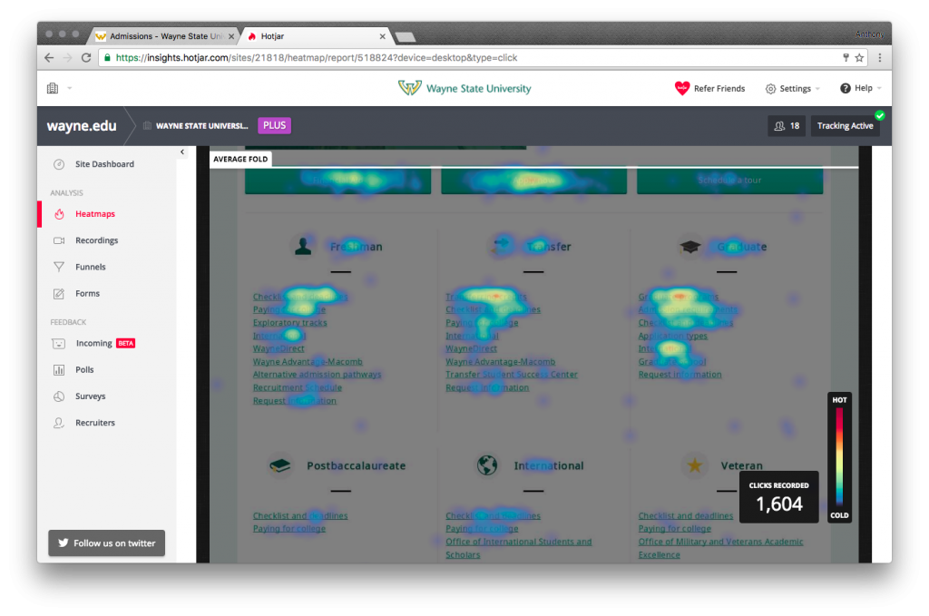
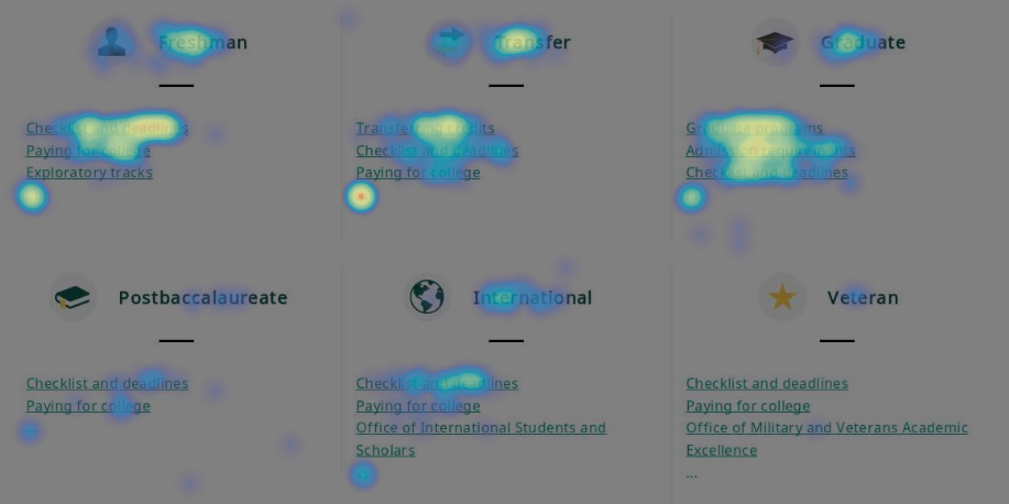
Initially, we thought users were clicking on a link below their audience heading and getting directly to their needed page. We decided to test this theory using a tool called Hotjar (opens new window) to record where users clicked on the page.
Although each audience listed their entire menu below the headings, the top three items were by far the most popular.
# Revised hypothesis
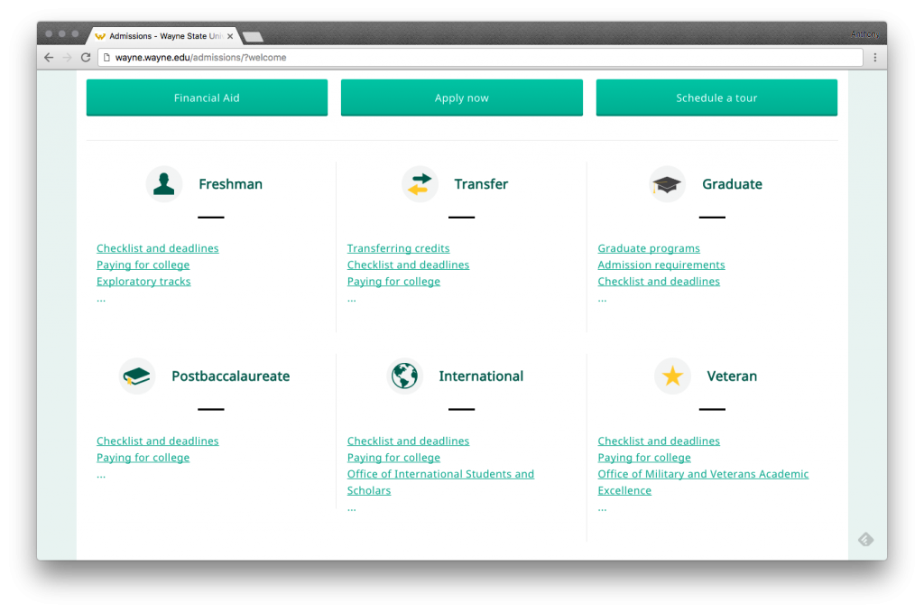
We decided to test if removing the least popular items made it more clear to users that they could visit an audience landing page. If this is the case, are they more likely to visit these pages by clicking the audience heading or ellipse at the bottom of the link list?
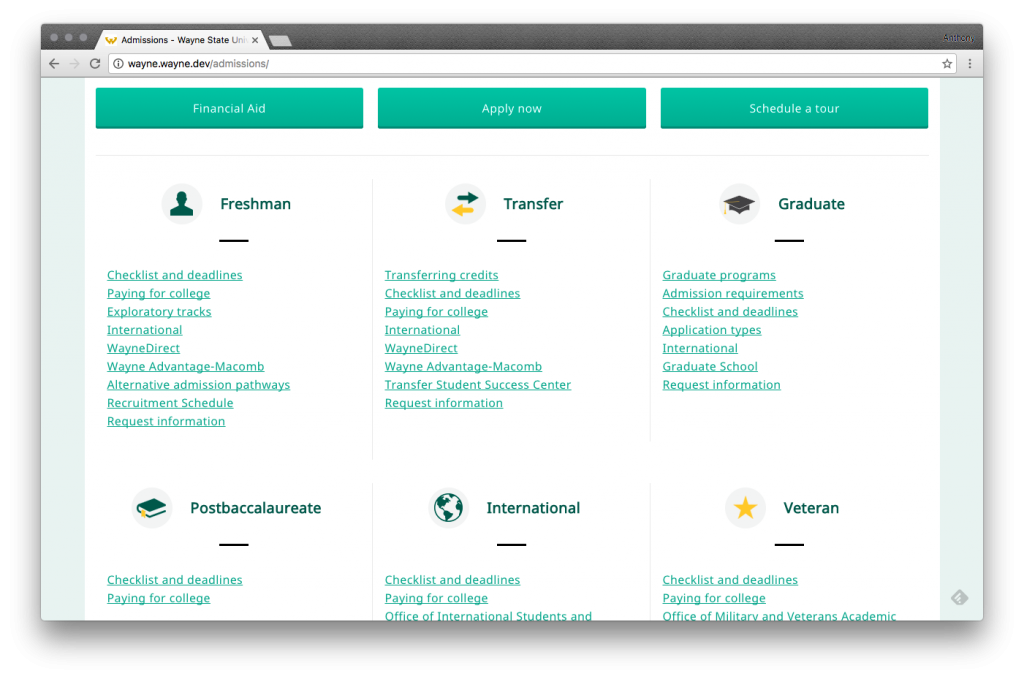
# "A" variant of the page
# "B" variant of the page
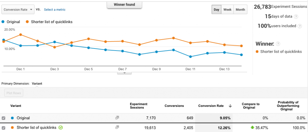
# Winner: Shorter list of links with the ellipses
After running the experiment for two weeks, Google found a statistically significant winning version.
# Headers or last item ellipse?
Of the clicks to the audience landing pages, the headers yielded ~2.5% of the clicks while the ellipses yield ~1%.
# Insights
The takeaway from this experiment is it's possible to go too far while reducing the depth of a website. Having everything accessible from the homepage may be good if you're familiar with all the options, but it can be overwhelming for unfamiliar users.
Keeping a website as flat as possible while reducing the number of choices to entice users along yields the most interactions. It allows for the addition of refined and contextual content to reinforce a user's decisions along each page of their journey.
